
CVCA
Introduction
Video
As the motion graphic designer for this project, I was responsible for acquiring stock footage, background music, video editing, and the creation of icons and vector illustrations. Working in collaboration with the Marketing & Brand Coordinator, I was provided with CVCA's branding guide and other marketing materials to ensure that the Introduction video was in line with the brands identity, voice, and overall style.


Example One
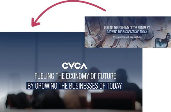
CVCA's brand guidelines influenced my use of typography, colours, as well as the placement and treatment of their logo. Another guide for approaching the creation of the introduction video was to reference marketing materials. These marketing materials gave me a better understanding of CVCA's style, use of hierarchy, and gradients.
The use of gradients is found throughout CVCA's branding, which is what inspired the different use of gradients within the video. The different gradient overlays allow the typography to be visible and legible enough over any of the footage used.
Example Two
Example Three

The size of the typography and use of colour once again refers back to CVCA's marketing materials and website. I wanted to keep the treatment of the typography and use of colour for emphasis as consistent as possible with CVCA's style and brand identity.
Example Four
The use of colour was also used as a way to separate information, differentiating Venture Capital and Private Equity. Changing the colour of the lines still keeps the design consistent, while showing a difference between the information being presented.
